
Bodies of Light: The Art of the James Bond Title Sequence
From the dancing silhouettes of From Russia with Love to the gilded bodies of Goldfinger, the opening credits of James Bond first three screen outings transformed a functional piece of filmmaking into an experimental art form. At the centre of that transformation were two designers, Robert Brownjohn and Maurice Binder, whose work challenged the boundaries between graphic design, typography, cinema and the flat, two dimensionality of film.
The film before the film
There is a peculiar moment in the cinema when a film has begun, but its story has not. The lights have dimmed, the curtains have opened, and the audience is suspended somewhere between the world they have left behind and the one they’re about to enter. It is here, in this strange transitional space, that the opening title sequence performs its magic.
For much of cinema's early history, credits were a largely functional necessity. Names of the producers, actors, and crafts people who collaborated to make the film appeared on cards, sometimes decorated with elaborate typography or illustrations, providing the necessary acknowledgements before the real business of the film began. Yet the idea that these opening moments might themselves constitute a miniature film, a self-contained work of visual art, would become one of the most exciting developments in twentieth-century motion-picture design.
By the early 1960s, the cinema screen had become a playground for a generation of designers who understood that typography could move, photographs could become sculpture, and the human body could serve as both canvas and projection surface. The opening credits were no longer simply announcing a film. They were beginning to interpret it.
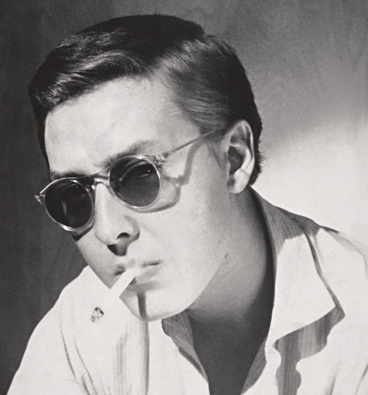
Young Brownjohn
Few films demonstrated this transformation more memorably than the early James Bond pictures, and few title sequences were as radical as those created for From Russia with Love (1963) and Goldfinger (1964).
Although Maurice Binder would become the name most closely associated with the visual identity of the Bond franchise, these two later sequences were actually conceived by the American graphic designer Robert Brownjohn. Binder had established the series' visual vocabulary with Dr. No (1962), but Brownjohn would take its possibilities somewhere altogether stranger.
What followed was a brief but remarkable collision between experimental art, commercial filmmaking, modernist graphic design and the mythology of James Bond.
Robert Brownjohn
Born in 1926 in Newark, New Jersey, Robert Brownjohn belonged to a generation of American designers who would radically alter the visual culture of post-war Britain.
He studied at Chicago's Institute of Design, an institution shaped by the ideas of the Bauhaus and its founder, László Moholy-Nagy. Architectural Forum noted that Bj, as he was known, “may have been the most talented student ever to have graduated from Chicago’s Institute of Design.” He personified the ideal his teacher expressed in Vision in Motion, that art and life can be integrated.
Moholy-Nagy instilled in his students that design was not simply a matter of arranging letters on paper. It was a laboratory in which photography, typography, architecture, light and movement could be brought together in unexpected ways.
In his 20s and 30s, Brownjohn established himself in world of the Mad Men, Madison Avenue, the booze socked heart of American advertising. His clients included Columbia Records, the American Crafts Museum, and Pepsi Cola. He also immersed himself in the underground, and subcultures of Chicago and New York in those Bohemian days just before the early morning light of the 1960s had broken. He counted Miles Davis among his friends, and fell for the trappings of the jazz world, heroin became his vice, although he never gave up the drinking habits of that came with the job.
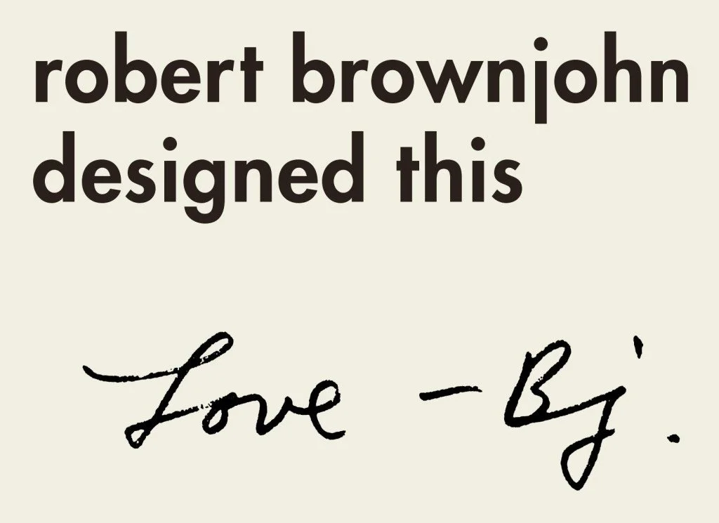
In 1960 Bj was offered a lucrative job in London, entering a creative scene that was rapidly becoming one of the most exciting in the world. London offered an unusual meeting place for American modernism and British irreverence. Graphic designers mixed with filmmakers, photographers, musicians and advertising executives, often borrowing ideas from one another with little regard for traditional disciplinary boundaries.
Brownjohn’s hip lifestyle and bombastic personality (once, when asked by a student “What is graphic design?”, he replied “I am.”) were perfectly suited to this new London. His graphic work was intelligent, provocative and frequently mischievous. His style was a new experience for the J. Walter Thompson staff. He was interested in found objects and typographic “junk” collected in the street, kept odd hours, was often absent, and spoke his mind.
His acquaintance with Bond producer Harry Saltzman helped bring him into the orbit of the increasingly successful film series, they met one night at a fashionable London party. Brownjohn had not yet established himself as a live-action filmmaker, but this lack of conventional experience would prove something of an advantage.
He approached the opening credits not as a miniature Hollywood production but as an experiment in graphic communication. And he was an ideas machine, with the philosophy of simple communication. And a desire to turn the mondain into the extraordinary.
Brownjohn reportedly pitched his concept for From Russia with Love by lifting his shirt and dancing in front of a slide projector, allowing the projected lettering to distort across his stomach. The producers understood the potential immediately, particularly when he explained that the finished sequence would feature a female dancer.
This was more than an amusing sales pitch. It represented Brownjohn's entire working philosophy. Rather than illustrating an idea with drawings, he wanted to make the idea happen physically, in front of our very eyes.
From Russia with Love (1963): Sex and typography
The second James Bond film, From Russia with Love, directed by Terence Young, presented Brownjohn with an unusual challenge. Its predecessor, Dr. No, had already introduced audiences to the stylised world of Bond, but the visual conventions that would eventually define the series were still being invented.
Brownjohn's response was a sequence built almost entirely around a belly dancer whose movements transform the film's credits into an unstable arrangement of light and flesh.
Against a dark background, coloured lettering appears across the dancer's body. As she moves, the words bend, stretch and distort over specific parts of her body. Names become momentarily illegible before reappearing against flatter surfaces. Typography, ordinarily associated with precision and clarity, is transformed into something unpredictable. The result is one of actually wanting to read and study the projected text as they dance across the dancer herself.
It is a remarkable inversion of graphic design's traditional purpose. Rather than organising information for the viewer, Brownjohn deliberately interferes with its legibility. The words remain recognisable as credits, but they are no longer simply credits. They have become moving images.
The dancer's body operates simultaneously as subject, screen and instrument of distortion. In his writing about the project, he observed that the available themes for a Bond film seemed to be sex and violence. He chose sex.
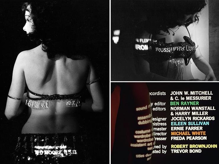
The production: A projector, a dancer and three days
The sequence was created with a reported budget of just £850. Working with animation assistant Trevor Bond - no relation - Brownjohn spent approximately three days filming and experimenting with performer Julie Mendez.
Neither Brownjohn nor Trevor Bond came to the project with conventional live-action production experience, and the process was notably improvisational. There was no detailed shot list dictating precisely how the finished sequence would unfold.
Other performers were also used. Accounts of the production describe a second dancer leaving the shoot and a third woman being brought in for facial close-ups, reflecting the producers' particular ideas about how their female performers should appear.
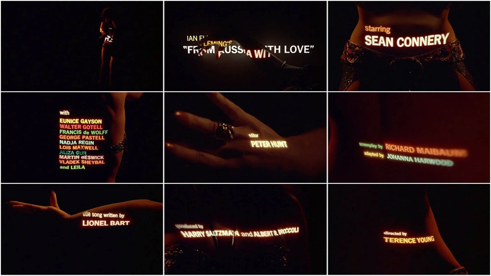
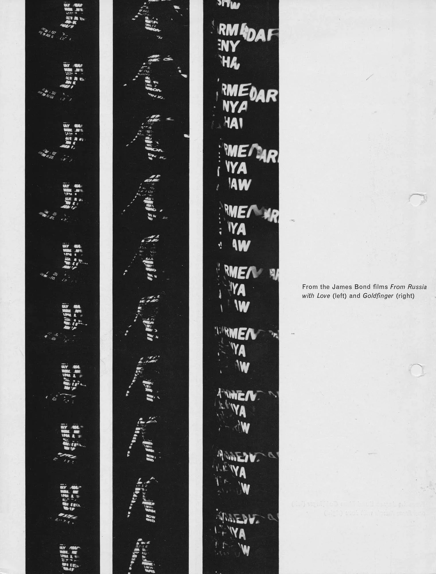
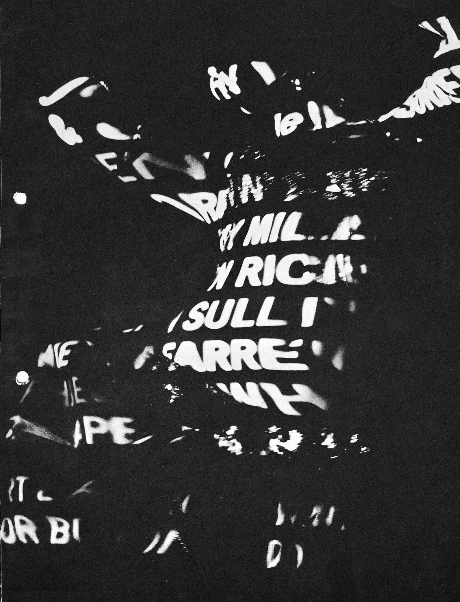
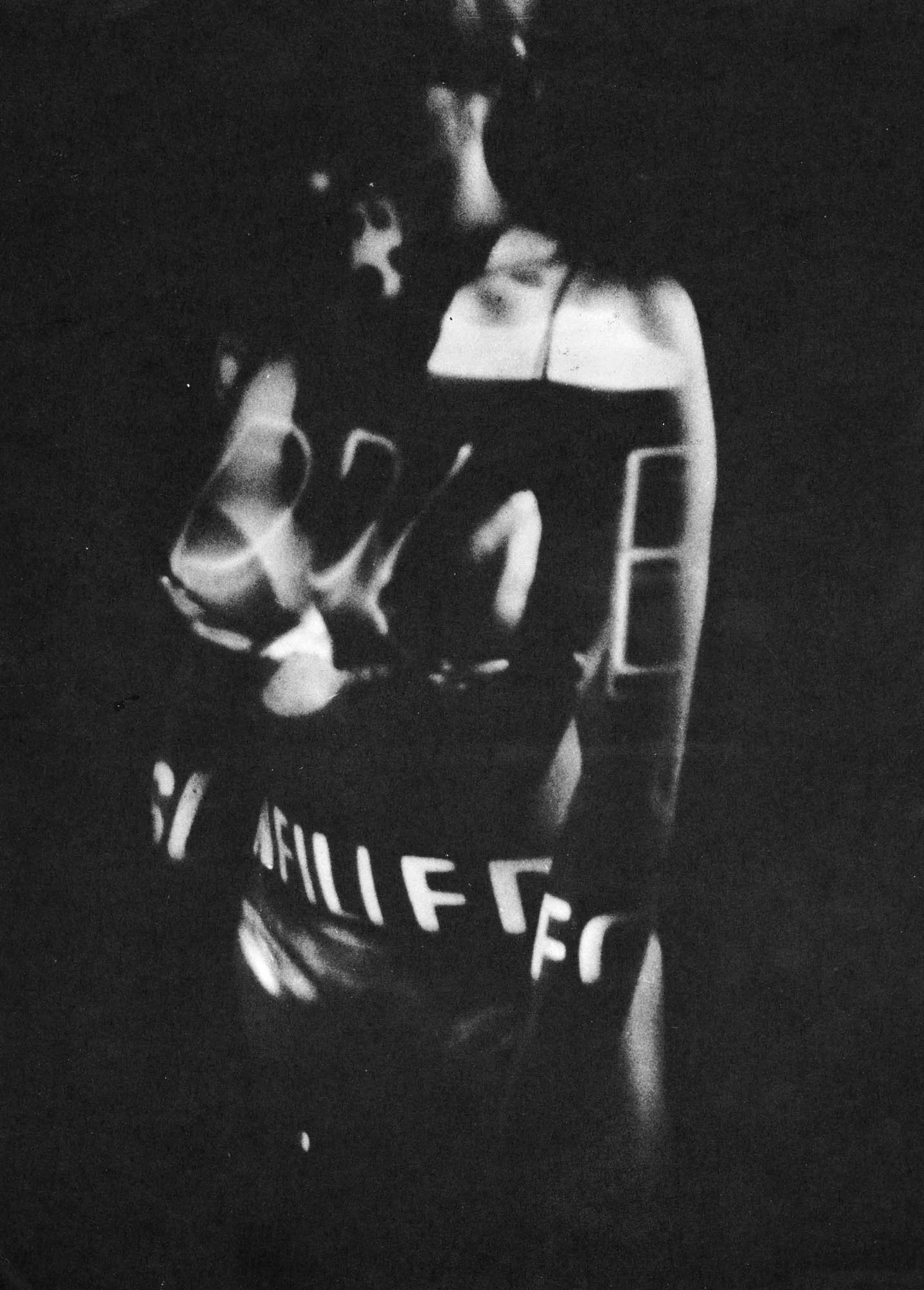
The principal technical challenge was illumination.
Projecting typography onto a body is straightforward enough in a dark room, but photographing that projection onto motion-picture film was considerably more difficult. The projected light was so weak that conventional exposure readings were almost useless.
A powerful 3,000-watt projector bulb was employed, and the camera was operated at a very wide aperture to gather sufficient light. This introduced another problem. Projection lenses have limited depth of focus, meaning that the dancer could not simply move wherever she pleased. She had to remain within a relatively narrow plane perpendicular to the projector while creating the impression of spontaneous, uninhibited movement. Every twist of her torso threatened to send the lettering out of focus. Every change in the angle of her body altered the shape and readability of the projected words. What looks like a carefree performance is therefore also a highly controlled negotiation between choreography, illumination and photographic technique. Brownjohn described the resulting process as a form of instant optical effects, achieved physically in front of the camera rather than through laboratory manipulation.
This distinction matters. The distortions were not added to the images afterwards. They were produced by the interaction of real light with a real, moving surface. The sequence was, in essence, a filmed experiment in optical perception.
Goldfinger (1964): The golden figure
If From Russia with Love was an experiment in projecting static typography onto a moving body, Goldfinger reversed the equation. This time the body would remain comparatively still while the images projected onto it moved. It was a simple conceptual development, but its implications were extraordinary.
For the third Bond film, directed by Guy Hamilton, Brownjohn created what remains one of the most distinctive title sequences in the history of popular cinema. The female body was no longer merely illuminated by coloured words. It became a golden projection screen upon which the imagery of James Bond's world could be displayed.
The woman at the centre of the sequence was Margaret Nolan, a British actress and model who also appeared briefly in the film as Dink, Bond's masseuse. Nolan was dressed in a specially made gold bikini and covered with gold-coloured make-up, transforming her body into a reflective sculptural surface. Brownjohn then projected moving footage across her skin, photographing the resulting distortions as the camera moved around her.
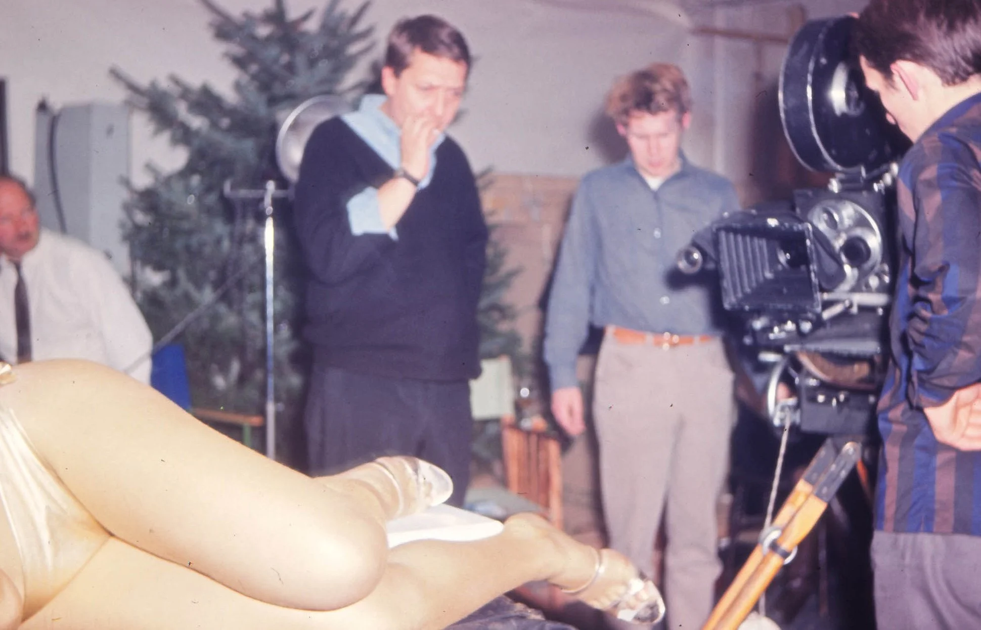
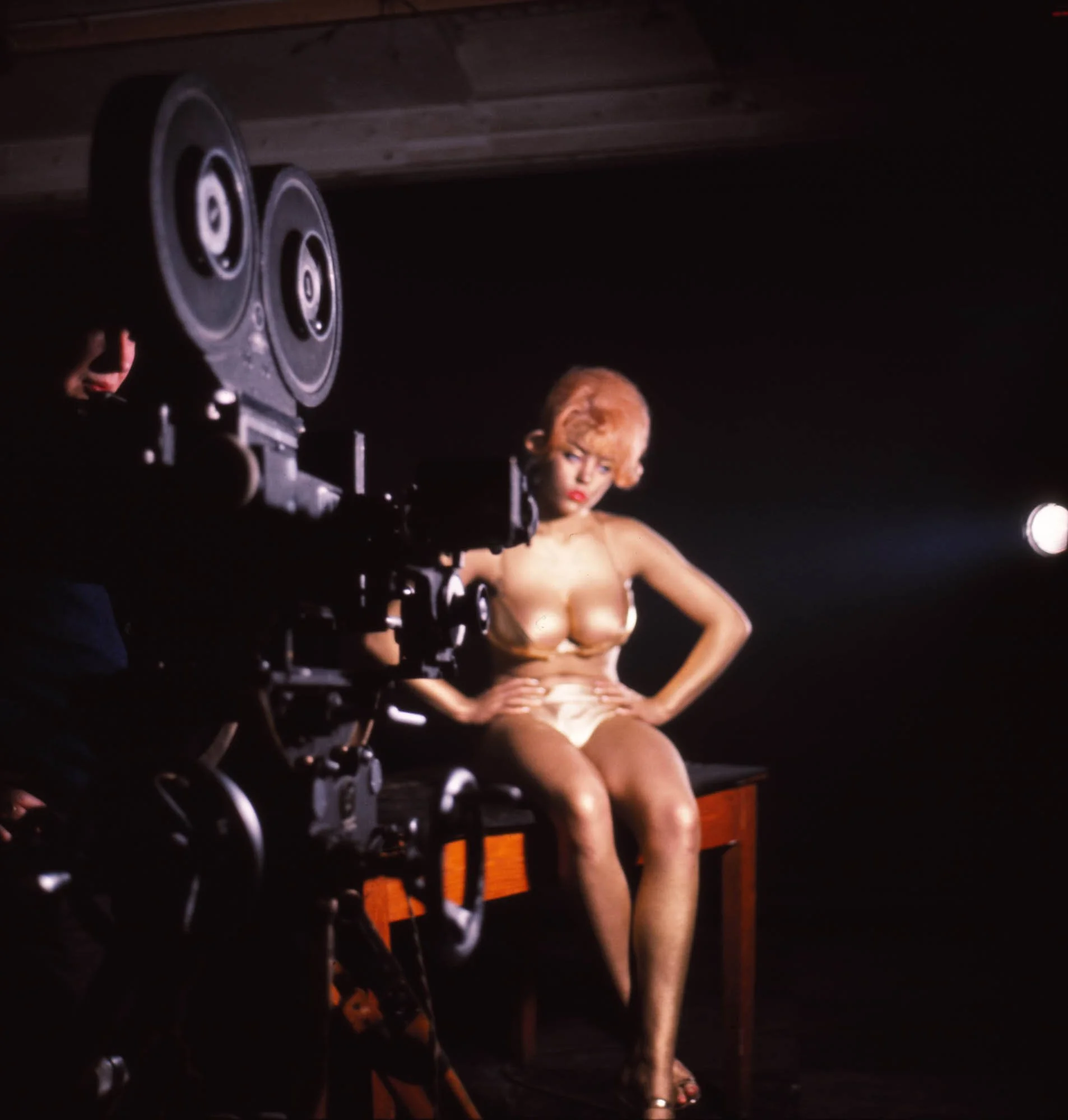
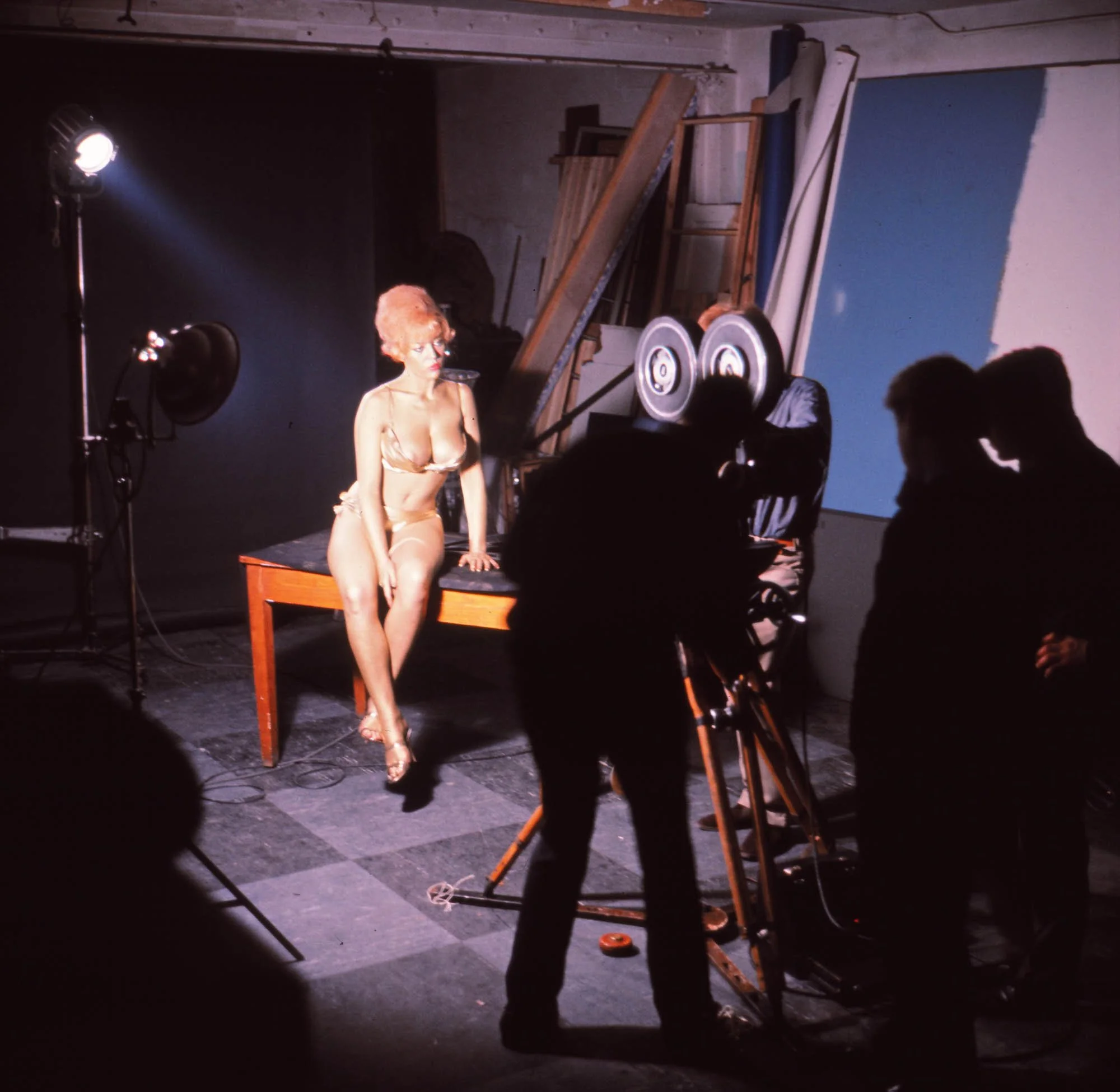
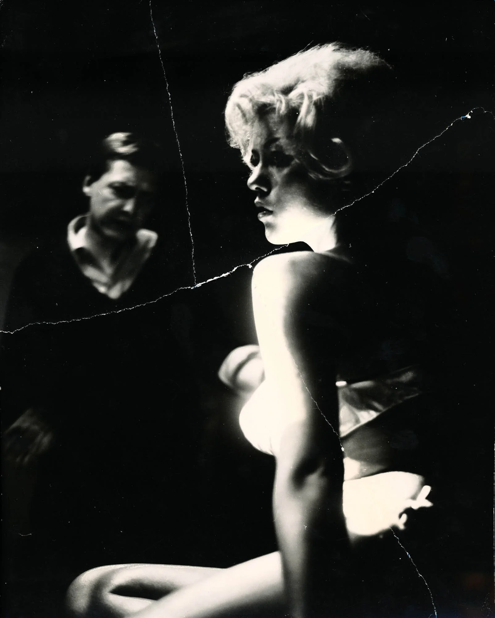
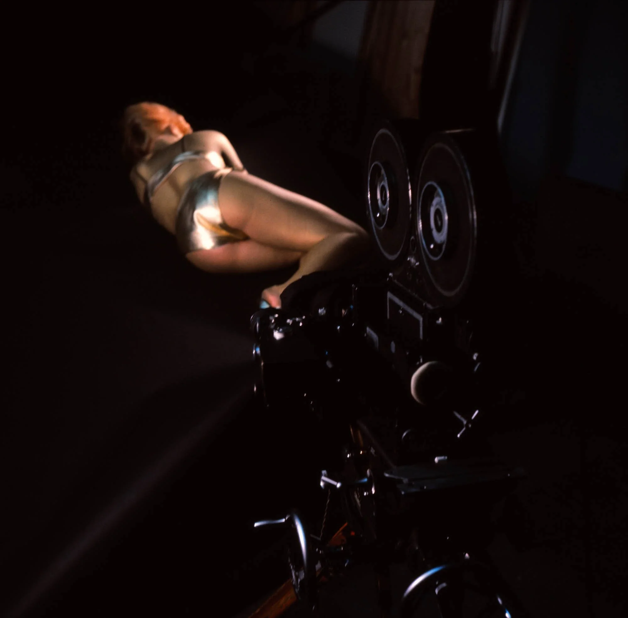
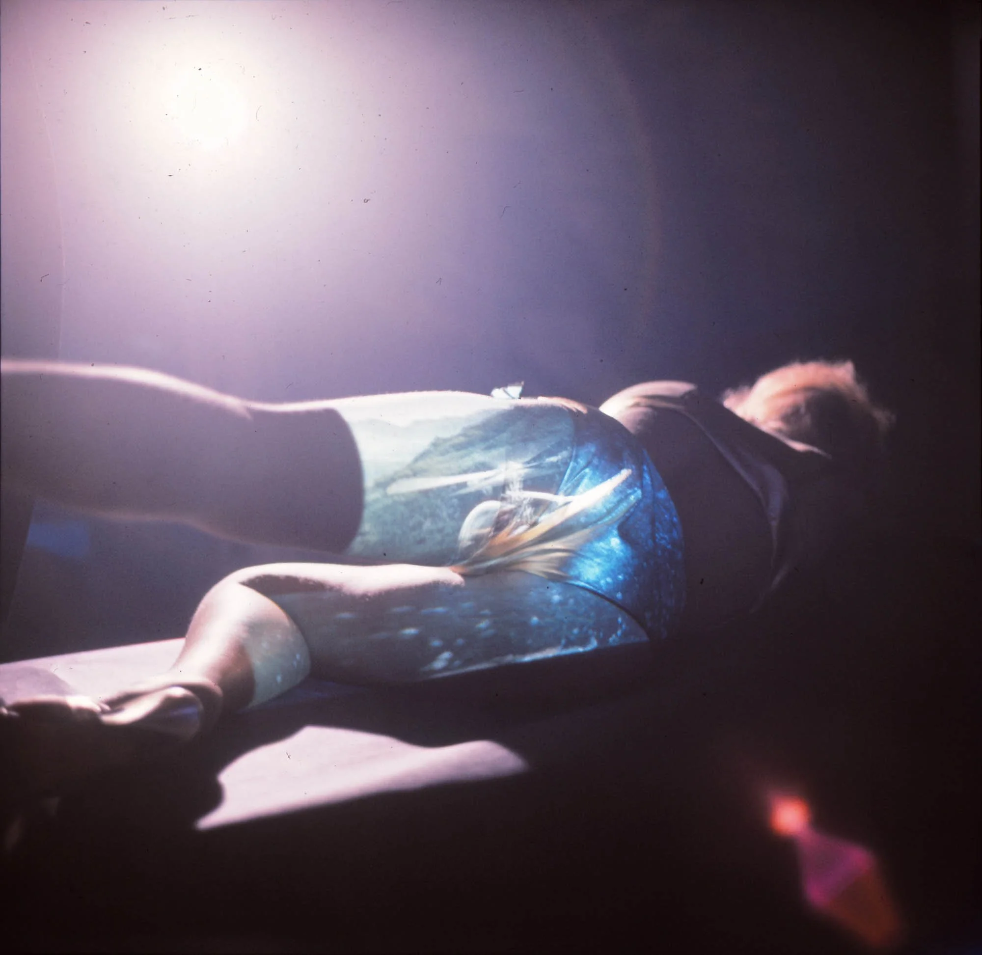
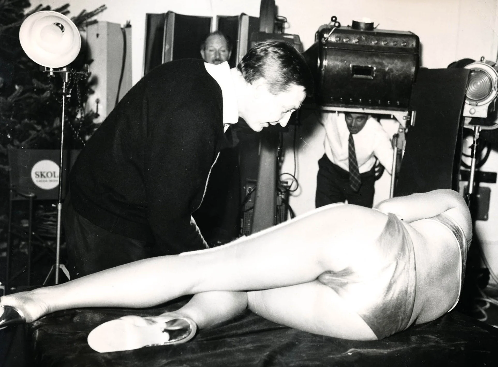
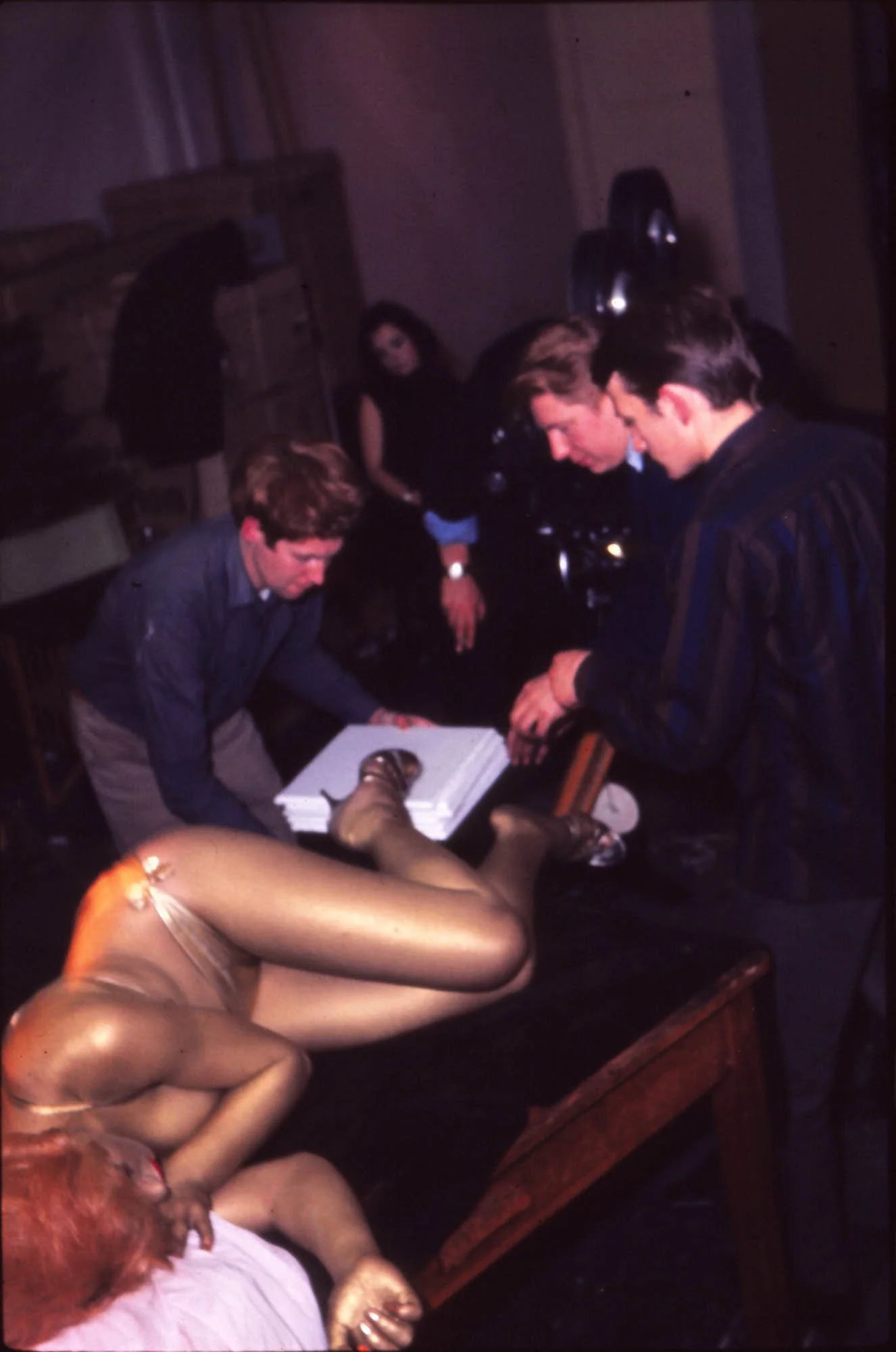
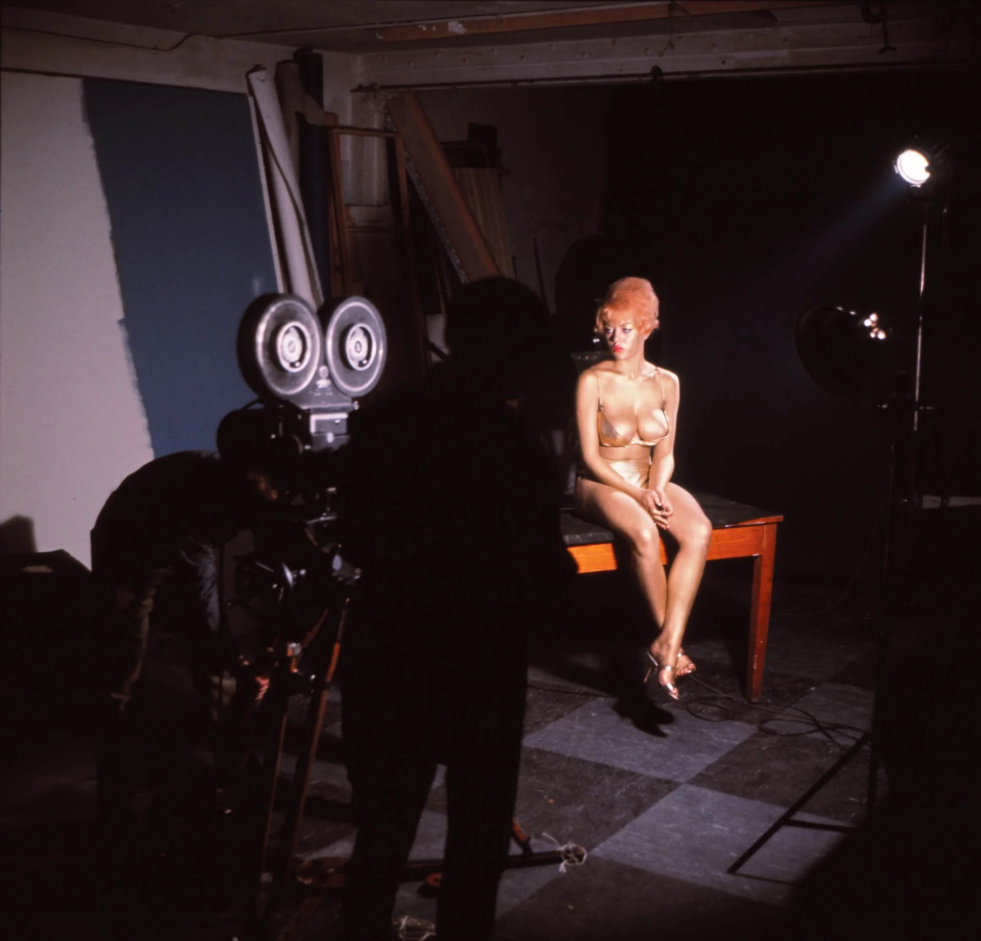
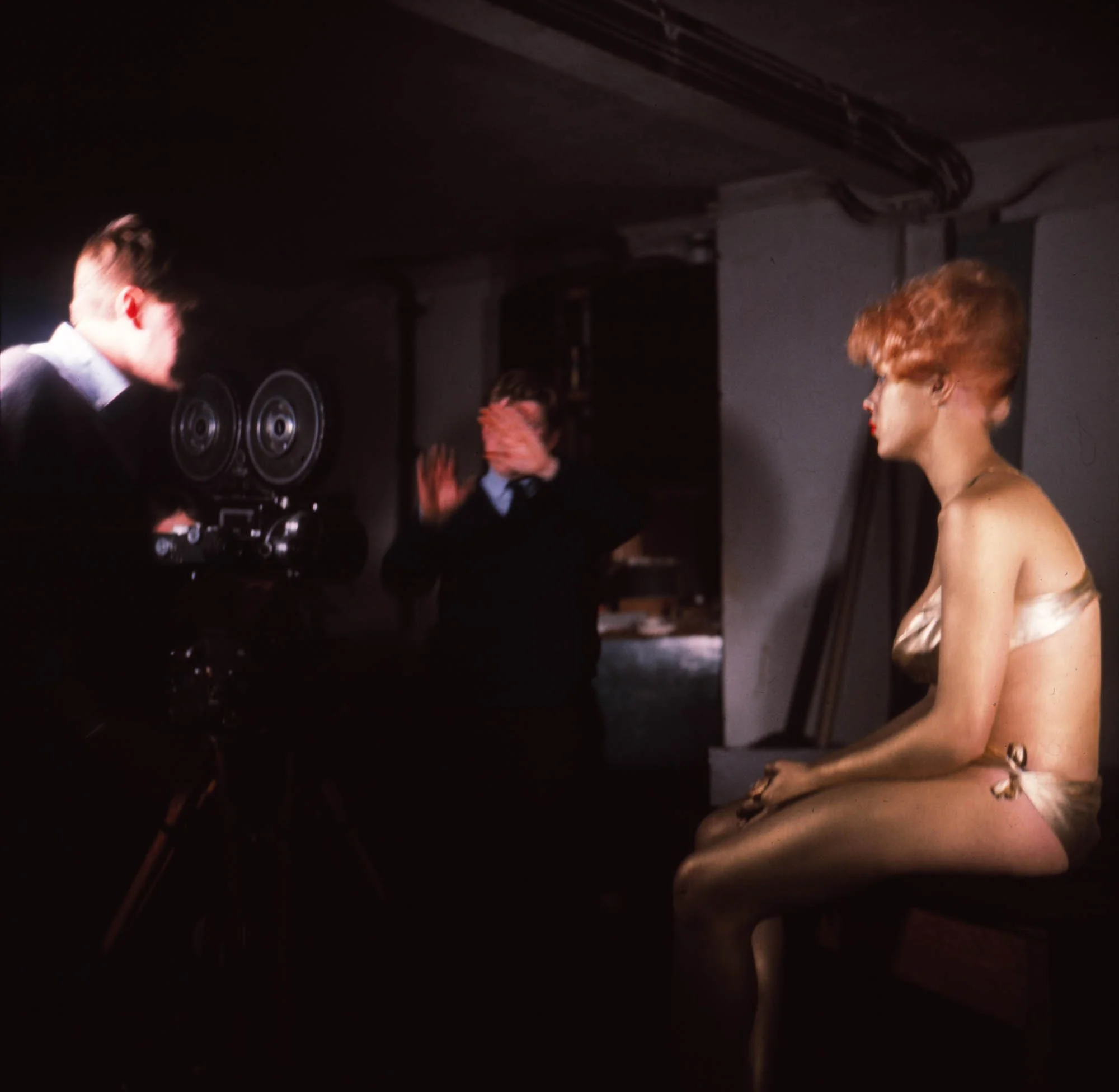
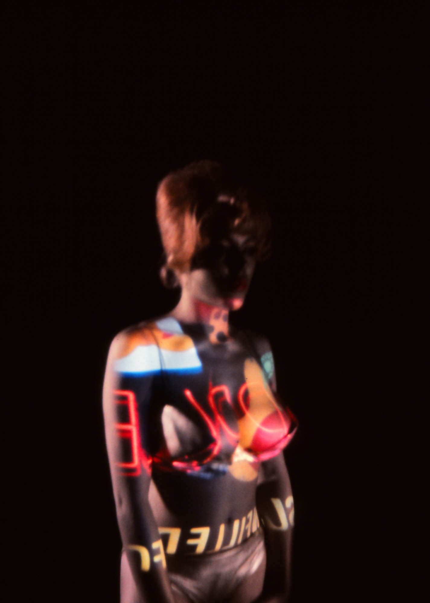
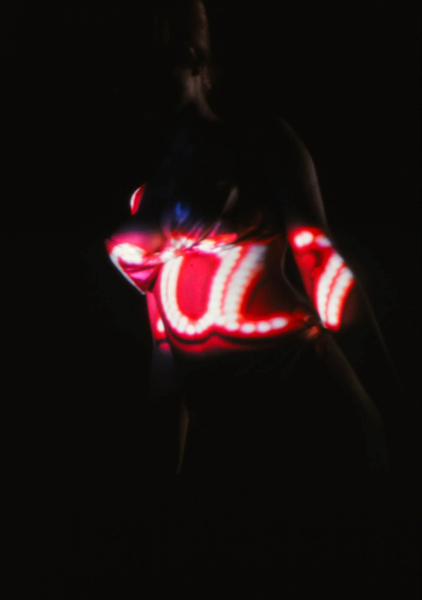
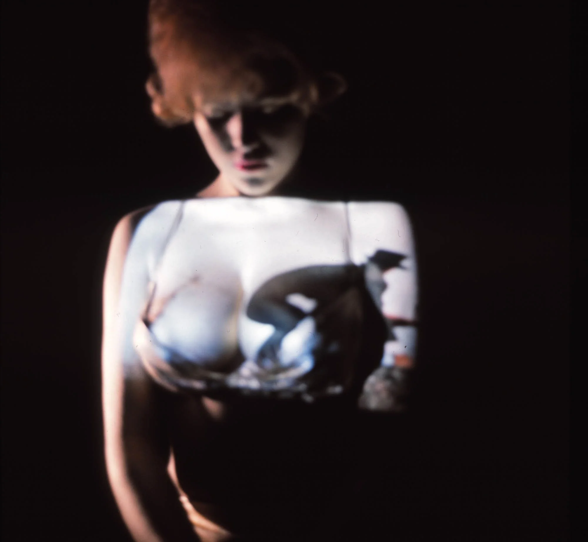
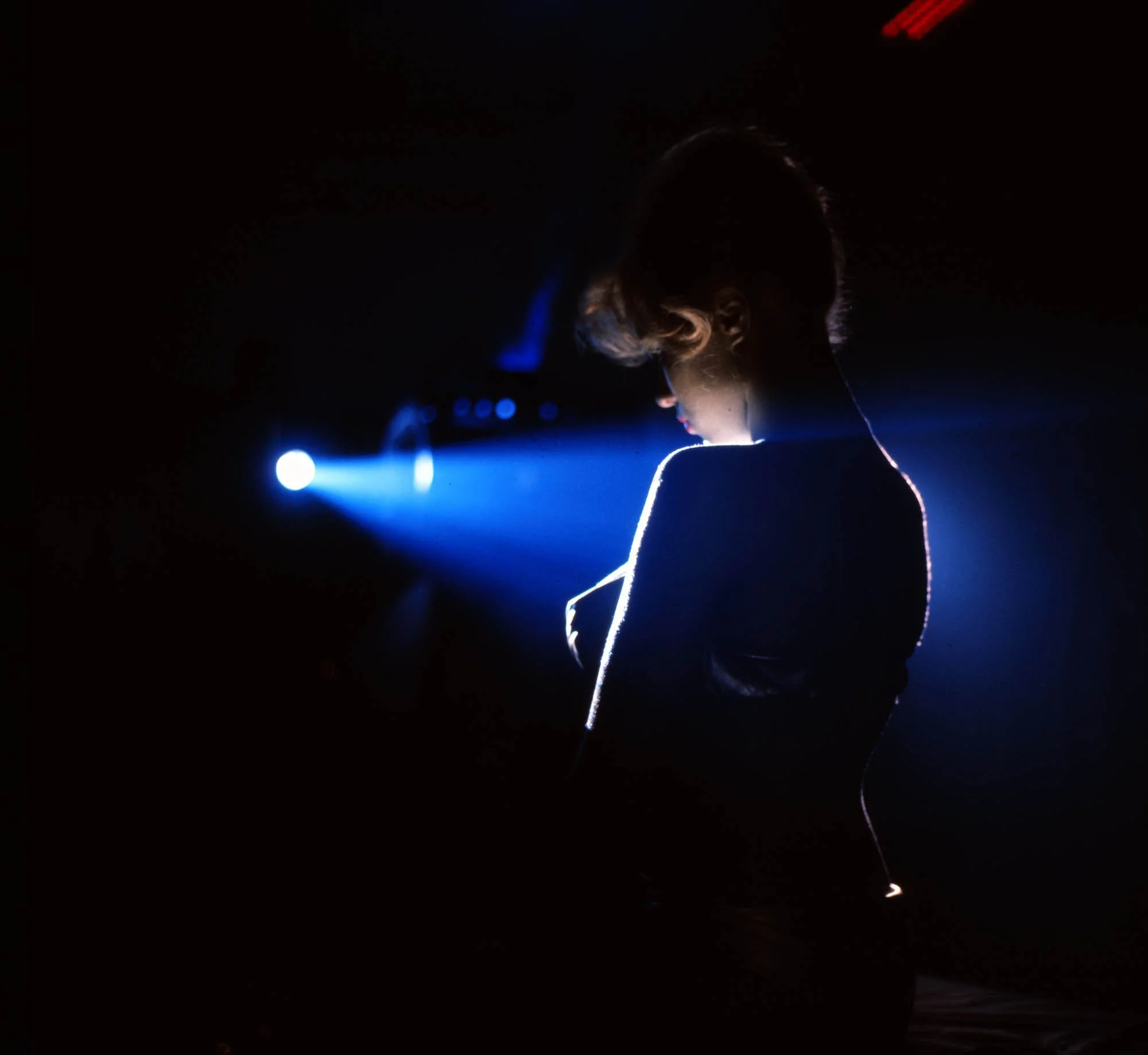
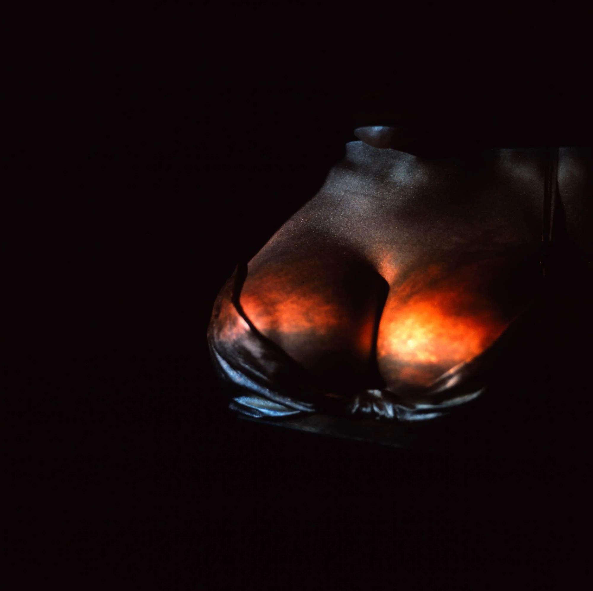
The projected material included sequences from the Bond films themselves: running figures, explosions, confrontations and other fragments of cinematic action. The result was a moving collage in which Bond's fictional world appeared to exist both upon and within the contours of the human body.
Making Goldfinger: The art of doing it “in camera”
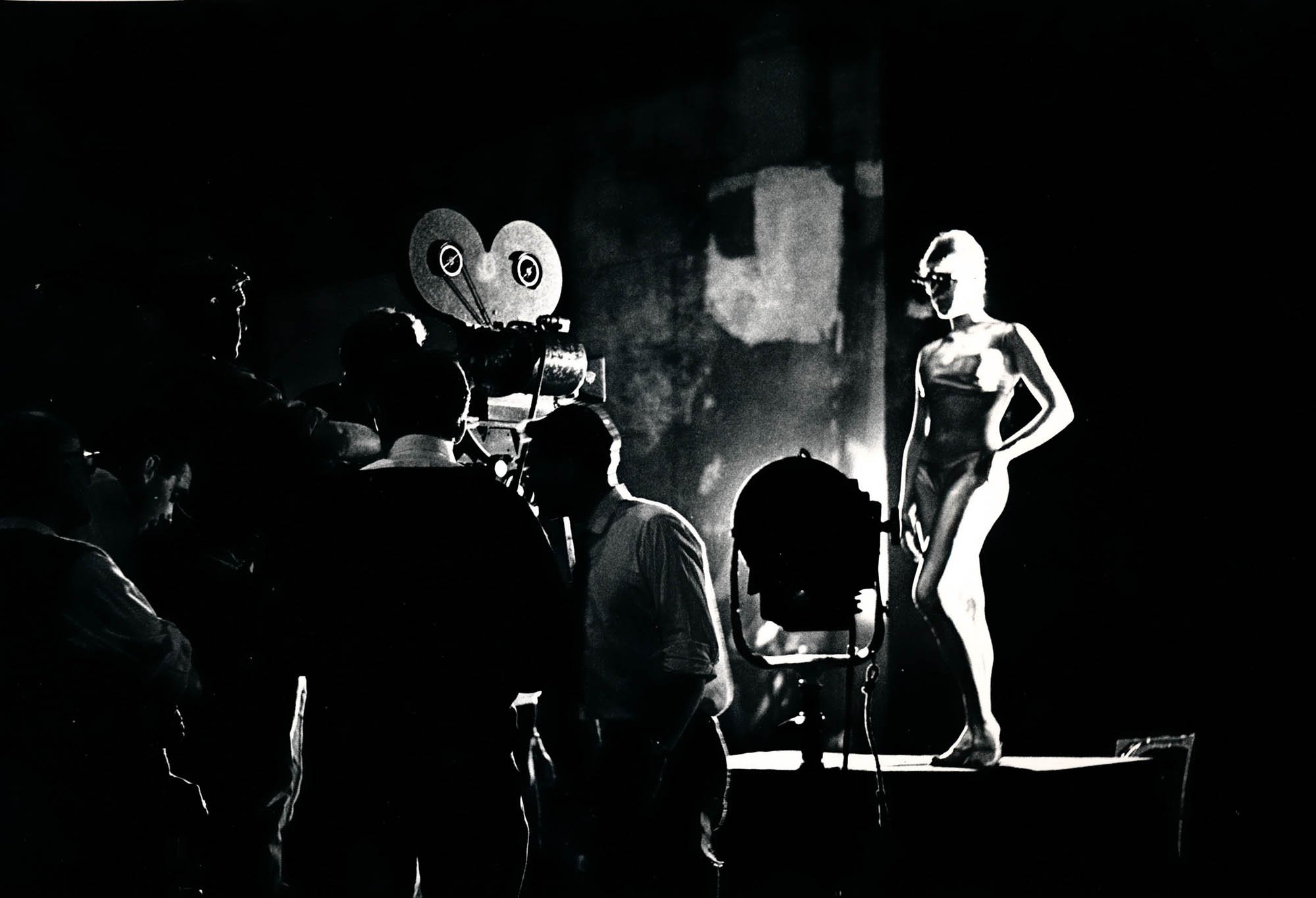
The production brought together Brownjohn, assistant Trevor Bond and graphic designer Herbert Spencer, who participated in the photographic sessions with Nolan.
The preparatory studies reveal a remarkably physical process. Rather than beginning with a completed graphic design and working out how to animate it, Brownjohn developed the images through experimentation with bodies, projection equipment, camera position and light.
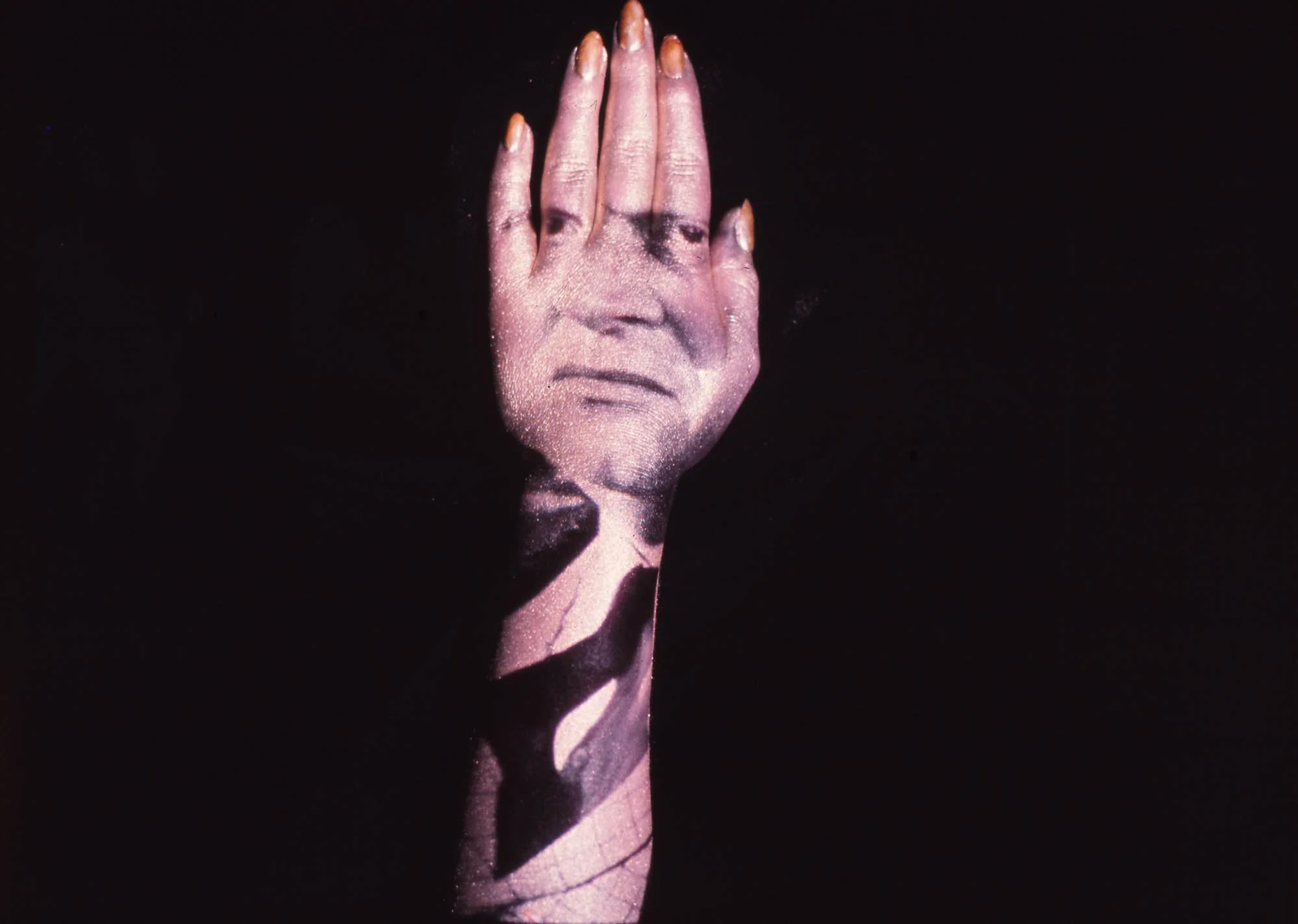
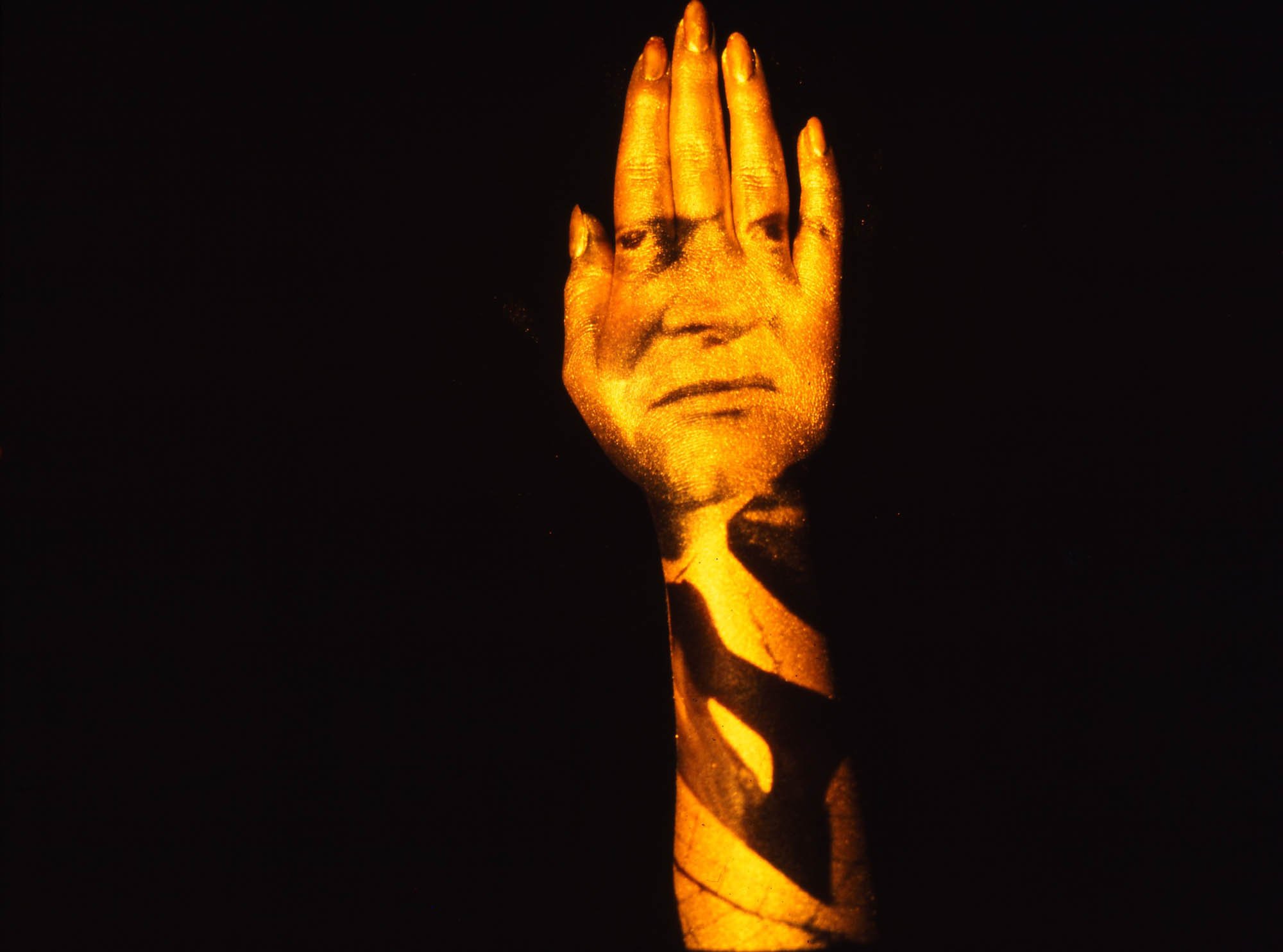
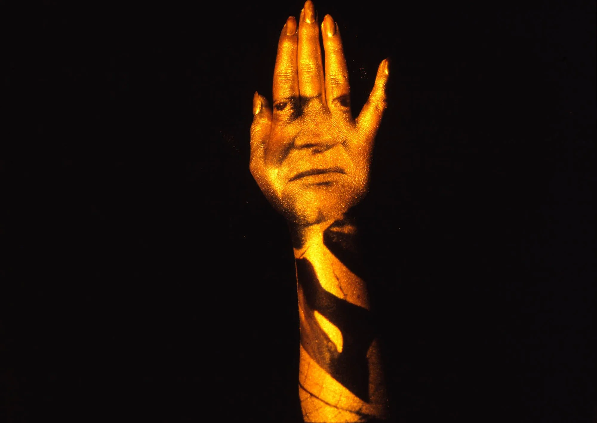
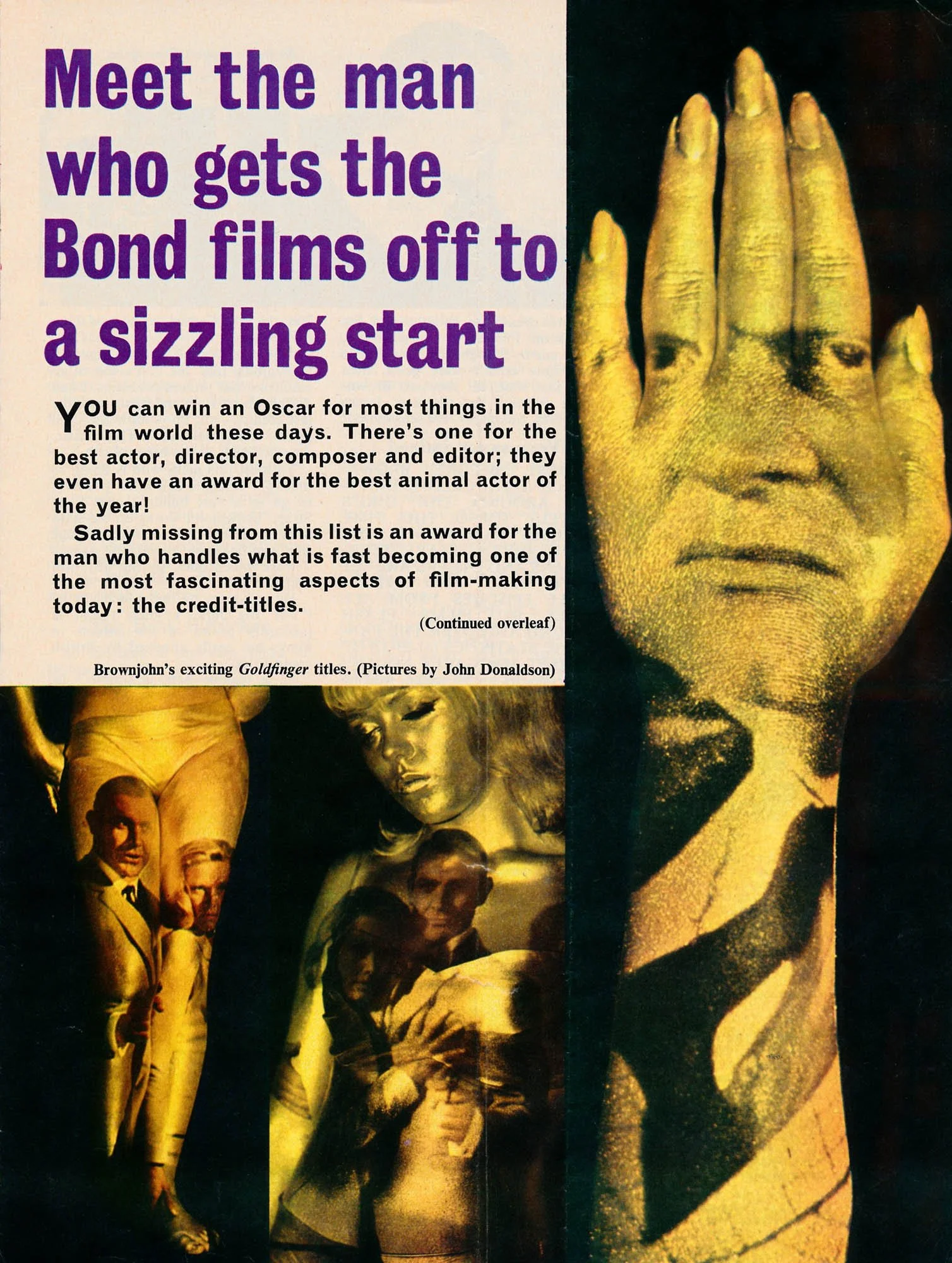
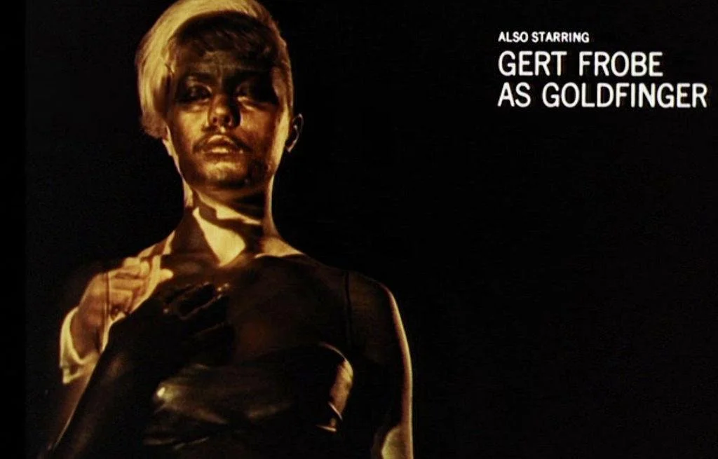
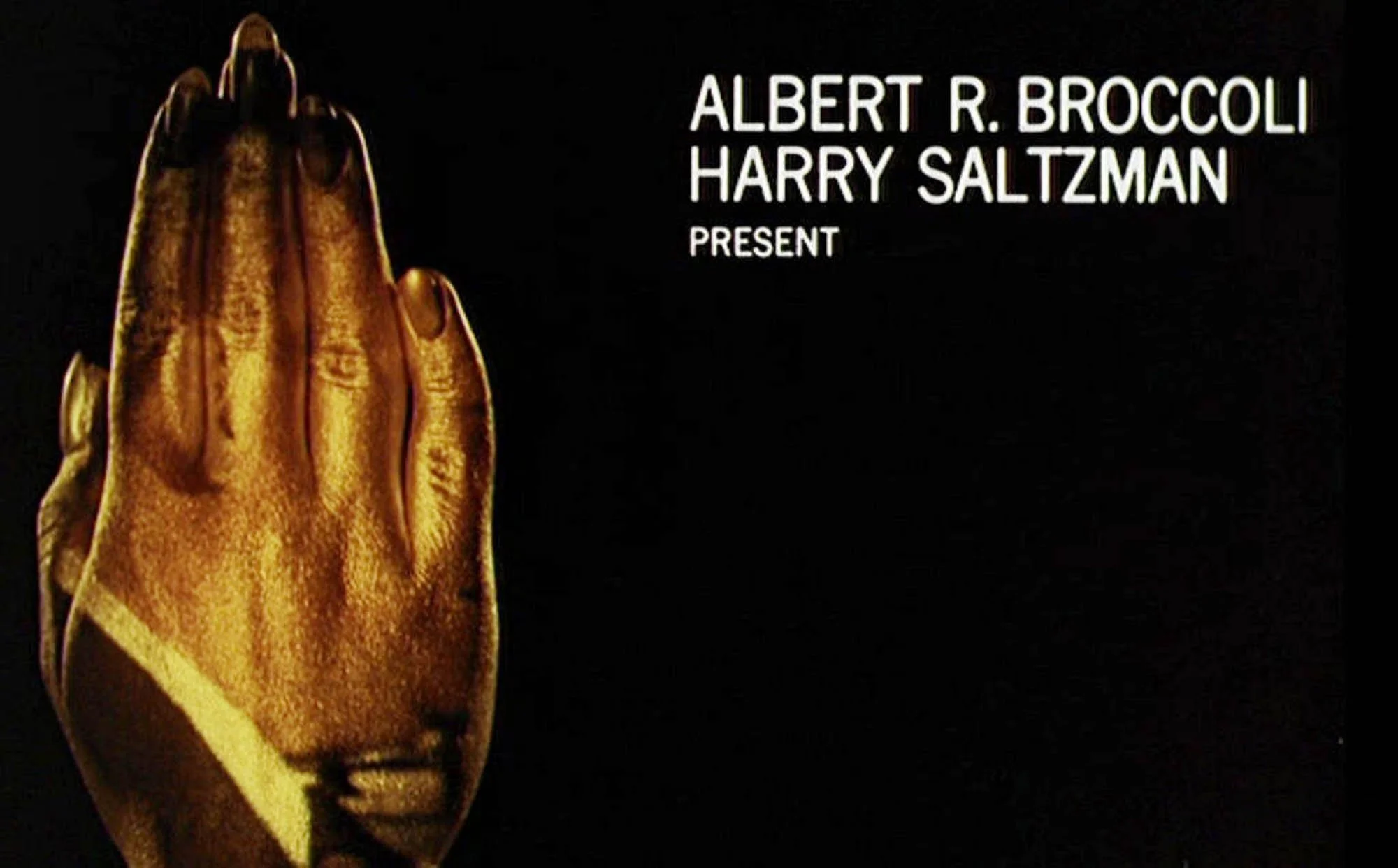
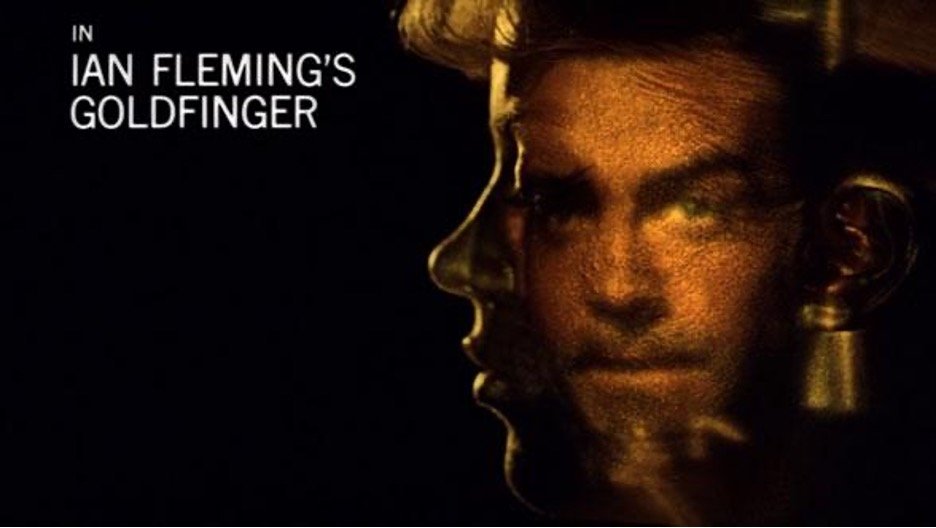
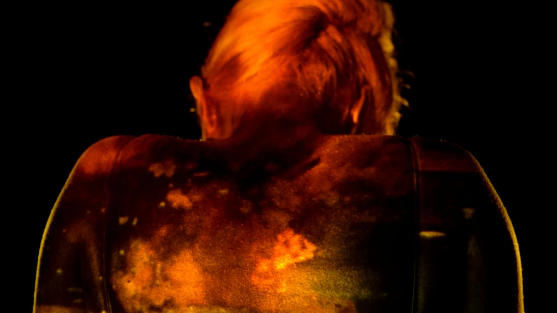
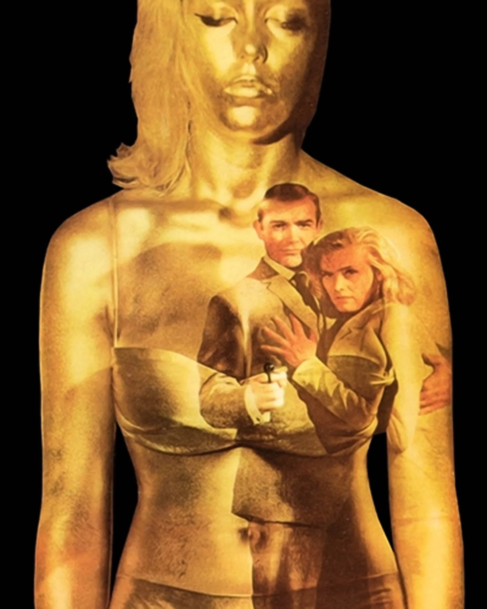
A powerful back-projection unit was used to throw moving film images onto Nolan's gold-covered figure. Brownjohn described the apparatus as a 100-amp projection unit. The gold make-up provided a surface that was both luminous and sculptural, giving the projections a quality that conventional superimposition could not easily reproduce. A figure running across Nolan's shoulder would bend around its curve. An explosion might flare across her torso. An image could disappear into shadow before reappearing on another part of her body.
Brownjohn argued that photographic double exposures and travelling mattes produced combinations of essentially flat images. Physical projection, by contrast, allowed moving pictures to be transformed by the contours of a three-dimensional object.
Margaret Nolan and the mythology of gold
Nolan's contribution to the sequence extended beyond the opening credits.
Her gold-painted appearance became central to the film's publicity, including its poster imagery, making her body one of the most recognisable visual emblems of the entire Bond franchise.
The connection between Nolan's gilded figure and the film's narrative is particularly important.
In one of Goldfinger's most memorable scenes, Bond discovers Jill Masterson, played by Shirley Eaton, dead, killed by suffocation due to being totally covered by gold paint, her skin unable to breath. The image has become inseparable from the film's mythology.
Yet the gold-painted woman in the title sequence and much of the accompanying publicity was Nolan, not Eaton. The distinction is frequently confused, demonstrating just how successfully the film's visual identity fused its narrative imagery with Brownjohn's abstract design.
Gold itself operates on several levels. It is the substance coveted by the villain, the source of his wealth and power, and an image of luxury that the film repeatedly associates with danger.
The woman is transformed into a precious object, something to be admired, possessed and displayed. It is difficult to ignore the troubling implications of this transformation, particularly when considered alongside Bond's broader treatment of women.
But the sequence is more complicated than a straightforward objectification of female bodies. Brownjohn's imagery repeatedly dissolves the distinction between person and object, between a human figure and a cinematic screen. Nolan is simultaneously a woman, a sculpture, a piece of advertising and a surface carrying moving pictures.
Shirley Bassey and the marriage of music and image
It would be impossible to discuss the Goldfinger credits without acknowledging the extraordinary contribution of Shirley Bassey. Her performance of the title song, written by John Barry, Leslie Bricusse and Anthony Newley, gives the sequence its dramatic architecture.
Where the visual imagery is fragmented and elliptical, Bassey's voice is monumental. The brass-heavy orchestration announces the film's scale, while her sustained vocal phrases provide a sense of continuity across Brownjohn's shifting compositions. The relationship between sound and image is not merely decorative. The song gives the sequence a beginning, an escalation and a climax, allowing a collection of abstract visual experiments
to acquire the emotional structure of a short film. The imagery does not literally illustrate every word of the song, nor does it attempt to summarise the narrative in conventional terms. Instead, it establishes a world of glamour, danger, violence and sexual intrigue through association. It is this combination of popular music and experimental moving imagery that makes the sequence feel remarkably contemporary.
Long before the music video became an established commercial form, Brownjohn was creating a short, self-contained visual work structured around a recorded song. The film's credits became an attraction in their own right.
When a title sequence entered the museum
The cultural importance of Goldfinger extends well beyond the Bond franchise. Brownjohn received a Design and Art Directors Club Gold Award for his work, and the sequence would eventually become the subject of serious museum attention.
In 2012, the Museum of Modern Art in New York presented Goldfinger: The Design of an Iconic Film Title, exhibiting the sequence alongside related preparatory material. MoMA identified it as the first film title sequence to enter its collection as a design work in its own right.
This recognition is significant. A sequence originally commissioned to introduce a commercial spy thriller had become an object worthy of independent artistic consideration. It was no longer simply the beginning of Goldfinger. It was a work by Robert Brownjohn.
Before Bond: The invention of the modern title sequence
Brownjohn's achievement becomes even more remarkable when placed within the wider history of film title design.
The idea that opening credits could possess their own visual identity did not originate with Bond. Silent cinema had already developed an elaborate vocabulary of decorative title cards, while experimental filmmakers had been exploring the relationship between typography, abstraction and moving images for decades.
But the transformation of the title sequence into a distinct cinematic art form is most closely associated with the American designer Saul Bass.
Bass's work for Otto Preminger's The Man with the Golden Arm (1955) provided one of the defining examples of this new approach. Instead of a conventional sequence of names, Bass introduced an animated composition of stark white lines against a black background. These eventually formed the image of a distorted arm, suggesting the film's central subject of heroin addiction.
The sequence was not simply an attractive way to present information. It expressed the psychological and thematic substance of the film through graphic abstraction.
Bass developed this approach further in his collaborations with Alfred Hitchcock.
For Vertigo (1958), he combined extreme close-ups of a woman's face with hypnotic geometric spirals created in collaboration with pioneering animator John Whitney. The resulting imagery suggests obsession, disorientation and psychological instability without revealing the film's narrative.
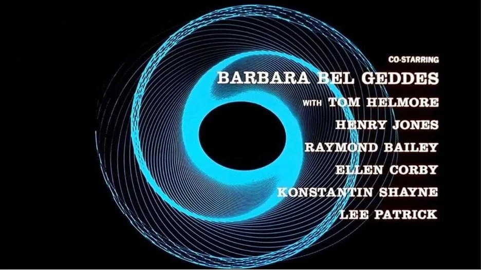
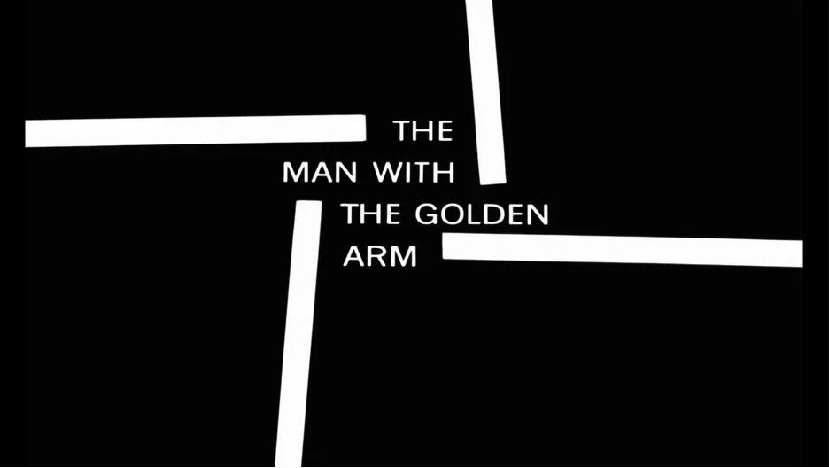
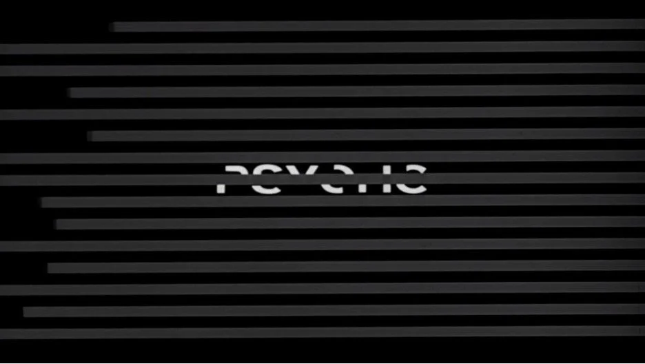
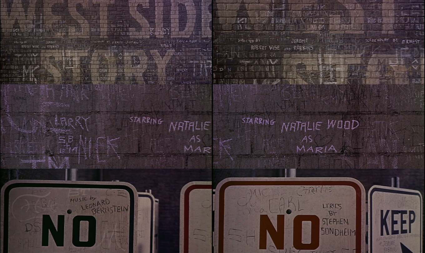
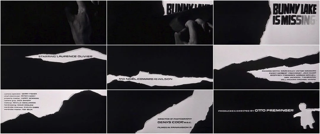
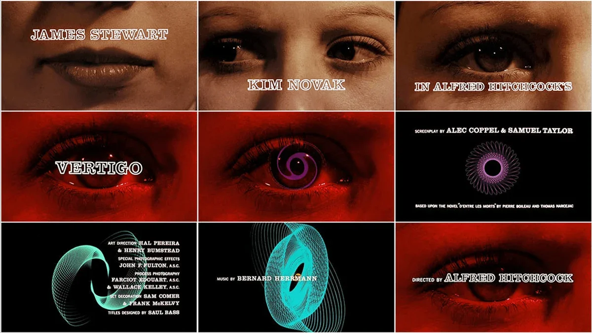
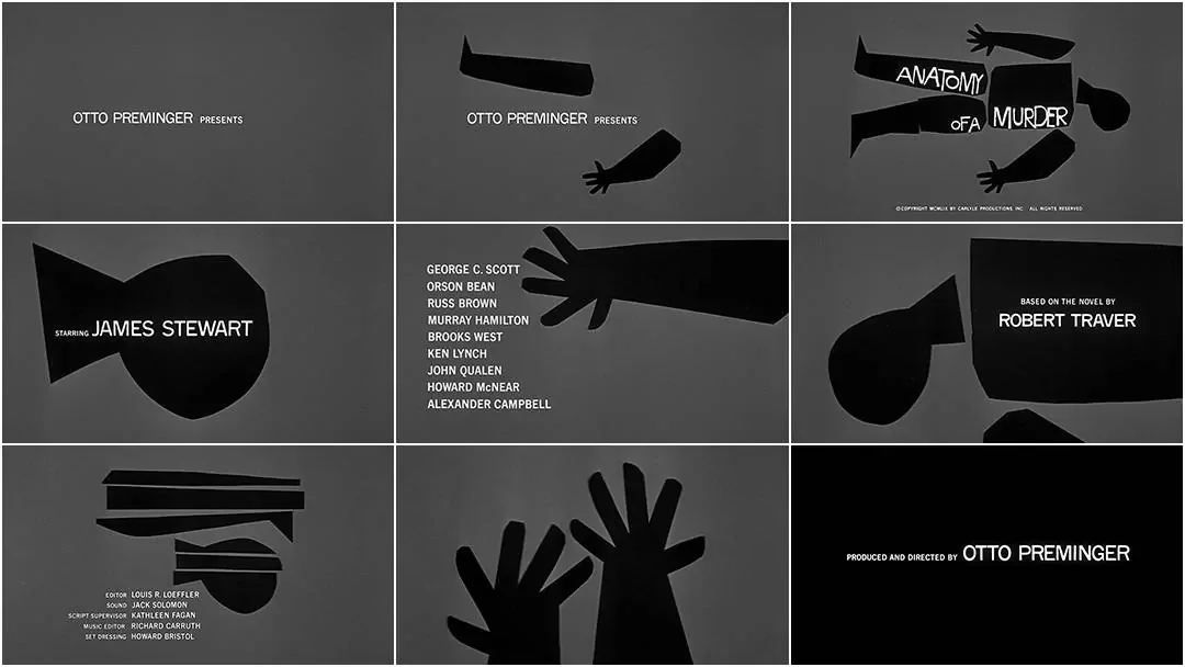
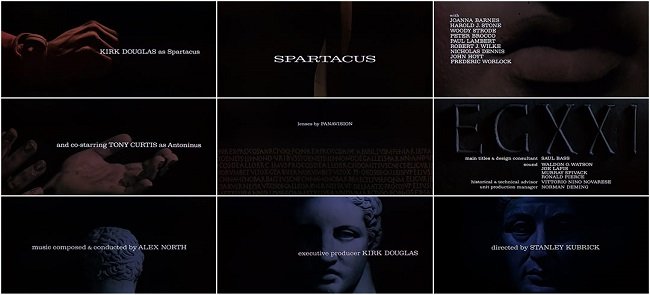
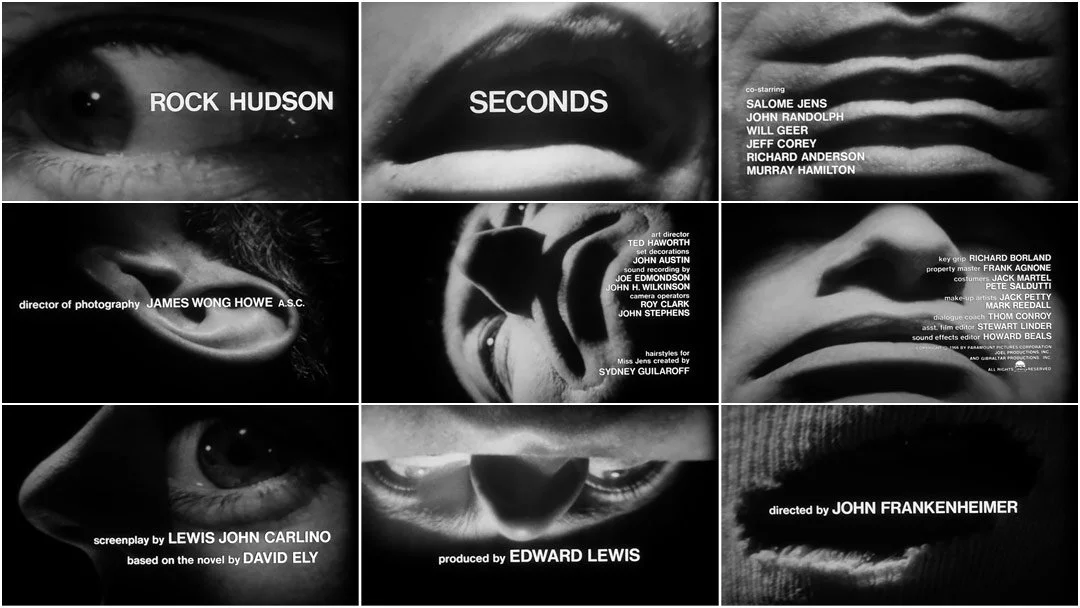
For North by Northwest (1959), moving lines of typography merge with the architecture of a modern office building, while Psycho (1960) uses fractured lettering and rapidly moving bars to evoke a world of violence and divided identities.
Bass understood that an opening title sequence could establish what he called a climate for the story that followed.
Brownjohn inherited this philosophy but approached it from a different direction.
Where Bass frequently began with a graphic symbol and developed its movement, Brownjohn preferred to discover images through physical experimentation. His work was less controlled, less geometrically precise and more interested in the unpredictable possibilities of photography.
Maurice Binder: The man who made Bond's titles a tradition
Although Brownjohn created the title sequences for From Russia with Love and Goldfinger, the designer most responsible for establishing and sustaining the Bond tradition was Maurice Binder.
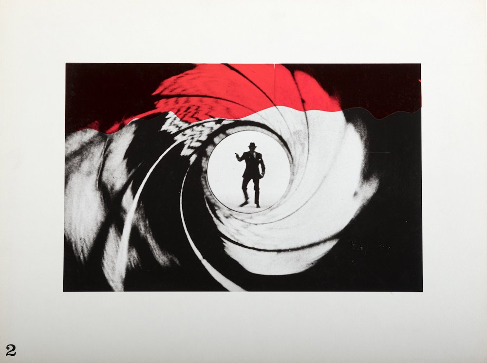
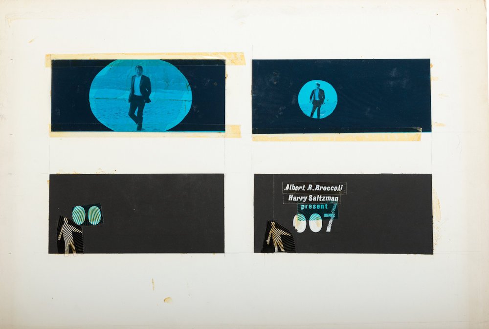
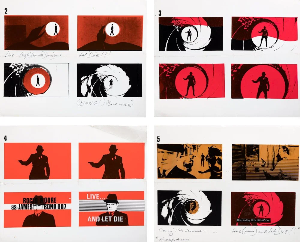
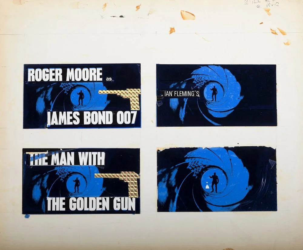
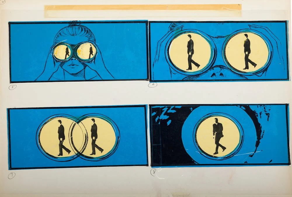
Binder had designed the opening titles for Dr. No in 1962, introducing the now-famous gun-barrel motif that would become one of the most enduring visual trademarks in cinema.
The idea was brilliantly simple. A silhouetted figure walks across the screen, turns and fires directly towards the audience. Blood runs down the image, transforming the act of looking into an apparent confrontation.
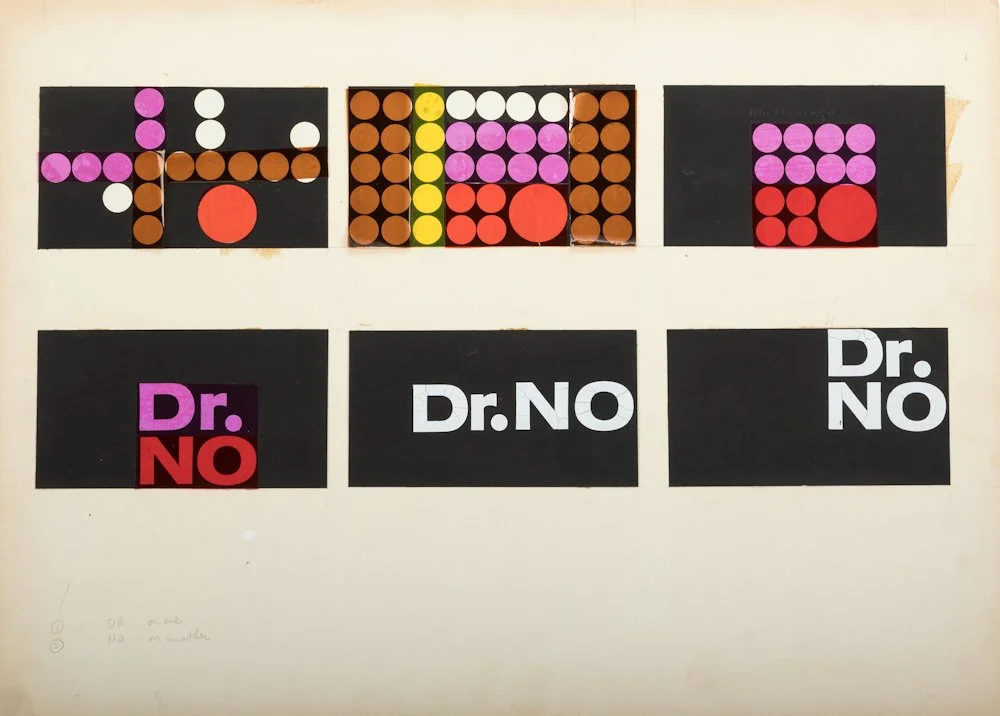
The motif was devised using remarkably modest materials. Binder later recalled preparing an early presentation with ordinary white price stickers, using their circular forms to suggest the gun-barrel imagery.
The original gun-barrel footage featured stuntman Bob Simmons rather than Sean Connery, and it was reused in From Russia with Love and Goldfinger despite Brownjohn's responsibility for those films' main titles.
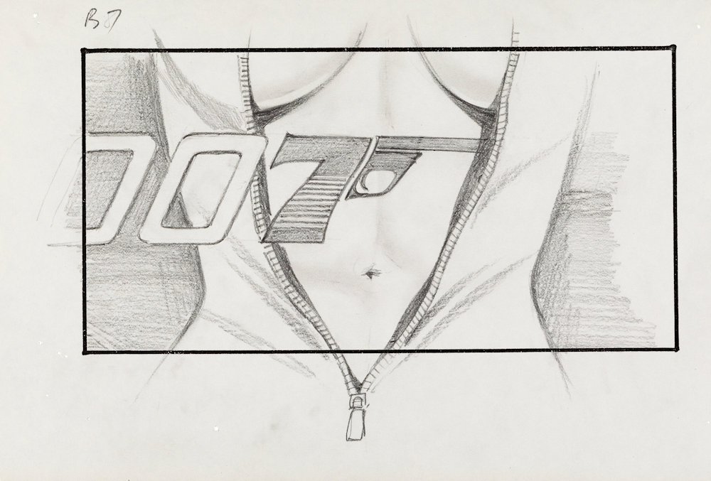
Binder's work for Dr. No also incorporated brightly coloured geometric dots, rhythmic graphic animation and silhouetted dancers. Its visual language was unmistakably modernist, but it already contained the seeds of the erotic abstraction that Brownjohn would develop.
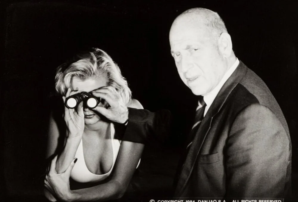
Binder did not design the next two Bond title sequences. Accounts of his departure cite a disagreement over payment, alongside his involvement with other work.
Following Brownjohn's success with Goldfinger, the producers reportedly offered to establish a dedicated operation for him to continue creating Bond titles. Brownjohn declined, and Binder returned to the series with Thunderball in 1965. It was a decision that would shape the visual identity of James Bond for the next quarter-century.
Thunderball (1965): A new visual language
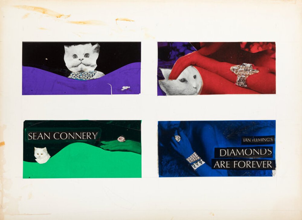
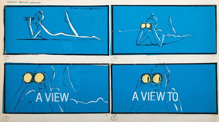
With Thunderball, Binder combined the graphic modernism of Dr. No with the sensual imagery Brownjohn had introduced. The sequence features silhouetted figures swimming through a blue underwater environment, their movements arranged into an abstract ballet of pursuit, danger and sexual suggestion. The underwater setting reflects the film's narrative, but the imagery operates according to its own dreamlike logic.
Binder increasingly employed optical compositing, combining separately photographed elements into complex arrangements that would have been difficult to achieve in a single exposure. The title sequence had become a recognisable Bond ritual: a pop song, silhouetted bodies, stylised violence, bold colour and a visual vocabulary that referred to the film without literally reproducing its story.
Binder would go on to create the titles for fourteen Bond films, ending with Licence to Kill in 1989.
The continuing experiments of Maurice Binder
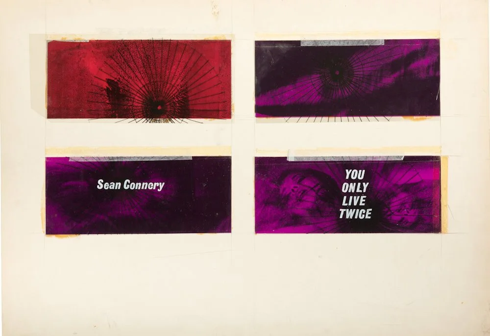
You Only Live Twice (1967)
Binder uses volcanic imagery, Japanese-inspired visual motifs and silhouetted figures to create a world in which the landscape itself seems to become an abstract body.
The Spy Who Loved Me (1977)
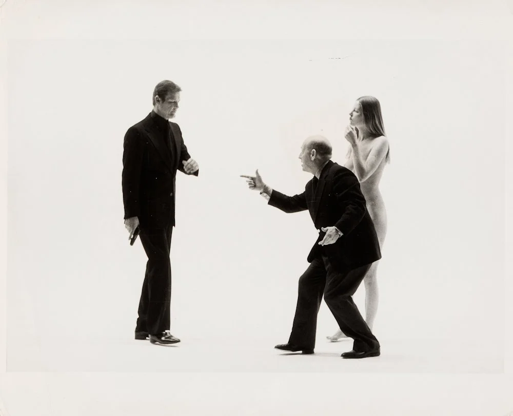
Roger Moore's Bond appears within the title sequence itself, a significant development in the series. The opening transforms the Union Jack parachute from the preceding action scene into a succession of floating, slow-motion figures and graphic compositions.
For Your Eyes Only (1981)
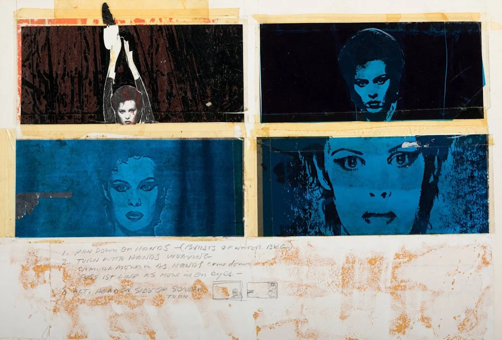
Binder incorporated singer Sheena Easton into the titles, making her the only Bond theme-song performer to appear singing within the main title sequence. Her softly illuminated face becomes part of the visual choreography.
Octopussy (1983)
Almost twenty years after Goldfinger, Binder returned to the idea of using the female body as a projection surface, this time employing laser imagery to create illuminated patterns across skin.
Binder's work reveals an interesting tension between innovation and repetition. The Bond titles became increasingly recognisable as a visual brand, yet Binder continued to experiment with new photographic techniques, compositing methods, lighting effects and approaches to movement.
By the 1980s, the sequences were also closely connected to the developing visual language of the music video. Pop songs, fashion photography, choreographed bodies and abstract imagery had become familiar ingredients of the new medium. Binder himself regarded his Bond titles as predecessors of the modern pop video, explaining that the song would come first and the images would be developed around it.
There is considerable truth in that observation. His sequences anticipated the way music television would combine performance, spectacle, fashion and graphic imagery into self-contained visual experiences.
But this influence also reveals a paradox. What began as a radical experiment in the early 1960s gradually became a commercial formula. The female silhouettes, enormous weapons, saturated colours and slow-motion choreography were repeated so frequently that they became part of the audience's expectations. The experimental image had become a corporate signature.
Binder died in 1991, two years after completing Licence to Kill. When the series returned with GoldenEye in 1995, Daniel Kleinman inherited a visual tradition that had become almost as recognisable as Bond himself. Kleinman introduced digital techniques while retaining many of the essential ingredients established by his predecessors.
After Goldfinger: The opening titles as an independent film
The influence of Brownjohn, Binder and Bass can be traced through decades of subsequent filmmaking.
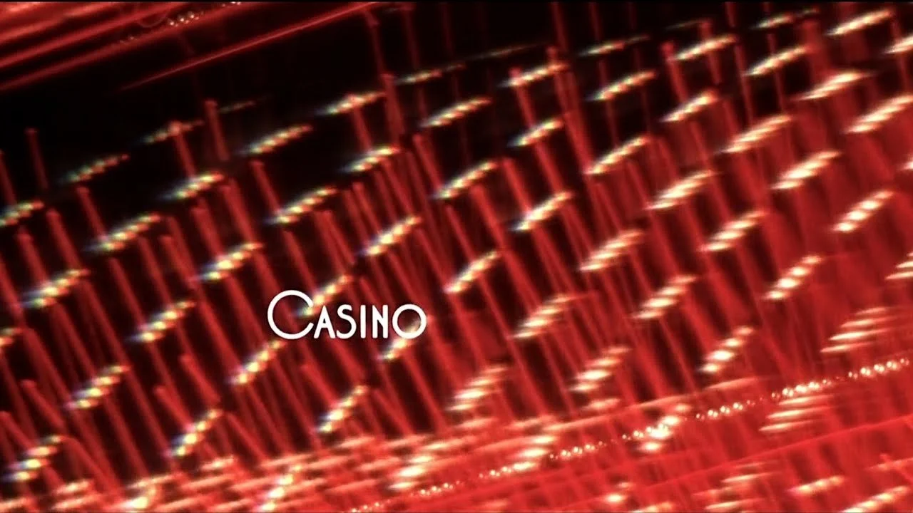
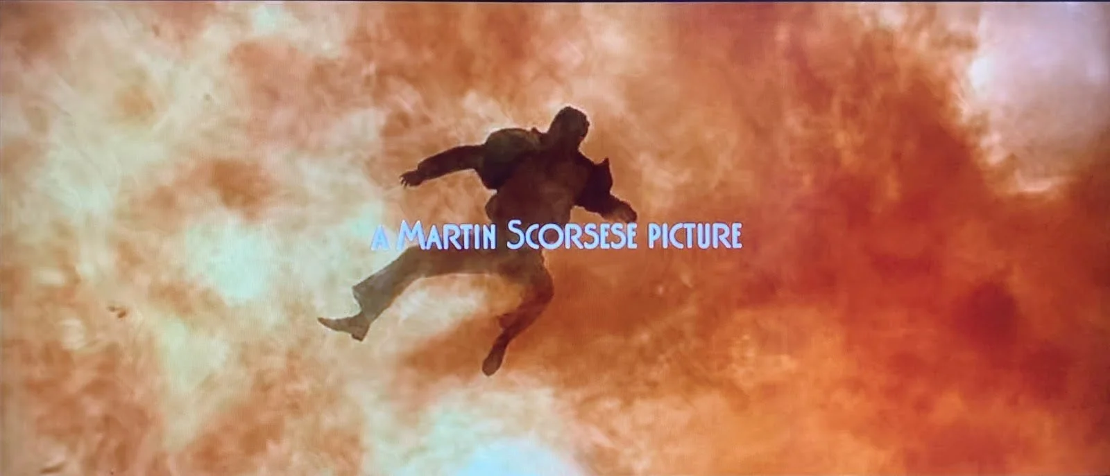
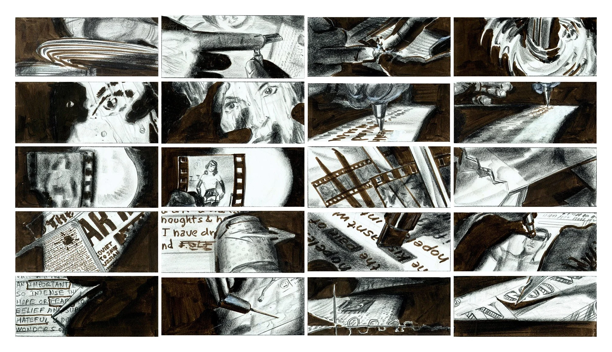
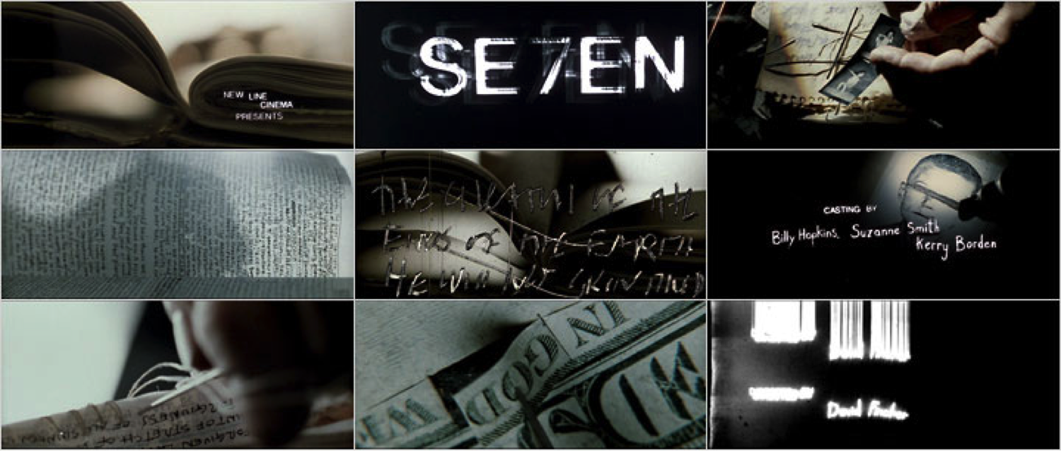
In the 1990s, Kyle Cooper's opening sequence for David Fincher's Se7en (1995) offered a particularly striking demonstration of how the title sequence could function as a work of cinema in its own right.
Through extreme close-ups of hands, handwritten notes, damaged film textures and unsettling photographic fragments, Cooper creates an intimate portrait of a disturbed mind without conventionally introducing a character. The sequence establishes a psychological world before the audience has fully entered the story.
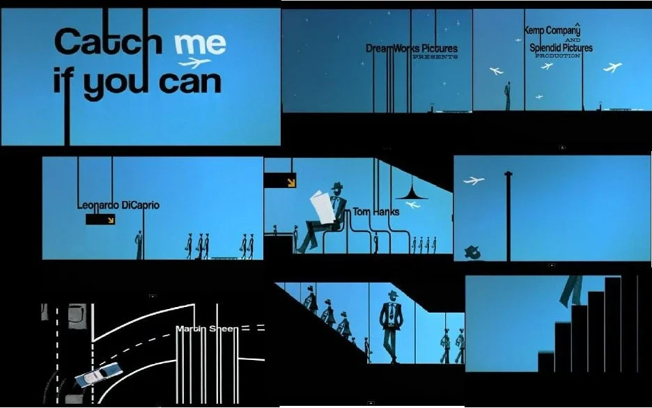
Steven Spielberg's Catch Me If You Can (2002), with titles designed by Olivier Kuntzel and Florence Deygas, draws more openly upon the graphic elegance of 1960s cinema. Its animated silhouettes and elongated typography transform the film's narrative of impersonation and pursuit into a playful exercise in visual design.
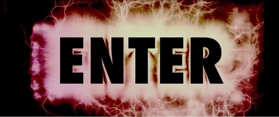
Gaspar Noé's Enter the Void (2009) takes another approach altogether. Its violently flashing typography turns the opening credits into an almost physically overwhelming audiovisual experience.
These examples are very different from one another, yet they share a fundamental principle. The opening sequence is not merely presenting a list of names. It is establishing a way of seeing. What makes the best examples so compelling is that they often employ a visual language distinct from the film they introduce. They can be more abstract, more experimental and more formally adventurous than the feature itself.
This raises an interesting question about their place within cinema. If a title sequence has its own visual structure, rhythm, soundtrack, editing, photography and thematic argument, at what point does it cease to be an accessory to the film and become a film in its own right? Yes it bloody does.